上周,一则麦当劳中国公司更名的新闻在微博上刷了屏。 工商信息数据显示,麦当劳(中国)有限公司已于2017年10月12日正式更名为金拱门(中国)有限公司,其各地分公司也在陆续更名。
网友立刻炸开锅,纷纷吐槽“太土”.......
Although the fast food chain reassured its fans on its Sina Weibo that stores in China will still bear the old name, the new moniker was immediately ridiculed by net users for sounding unsophisticated.
尽管该快餐连锁公司在新浪微博上向其粉丝保证中国的门店不会改名,但新名称还是因为听起来太“土”而遭到网友嘲笑。
网友反响如此热烈,麦当劳也立刻抓住机会进行了一波宣传,在微博上卖着萌解释说,改名只是证照层面……
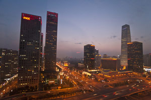
据了解,此次更名的一系列变动是在麦当劳成为中资控股之后发生的。
McDonald's low-key name change came after the fast food chain sold the bulk of its Chinese mainland and Hong Kong business to financial conglomerate CITIC Group and American investment company Carlyle Capital in January.
在麦当劳(中国)有限公司在低调改名前,已于今年1月将其中国大陆和香港的大部分业务出售给中信集团和美国投资公司凯雷资本。
麦当劳解释说:“这一变更主要在证照层面,日常的业务不会受到任何影响”,且“麦当劳餐厅名称、食品安全标准、营运流程等保持不变”。
话说回来,公司改名为什么会选择“金拱门”一词呢?
其实,这其中大有名堂。
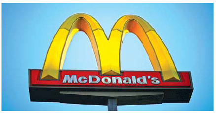
金拱门,即“Golden Arches”,正是麦当劳的标志和象征。
先推荐大家去看一部去年上映的电影,迈克尔·基顿主演的《大创业家》(The Founder)。
影片中,推销员雷·克洛克在上世纪50年代遇到经营汉堡快餐的麦当劳兄弟之后嗅到了商机。1961年,他买下麦当劳兄弟的汉堡连锁,将其打造成了全球最大的快餐王国。
The story follows Ray Kroc, a salesman who turned two brothers' innovative fast food eatery, McDonald's, into the biggest restaurant business in the world with a combination of ambition, persistence and ruthlessness.
这部电影讲述了推销员雷·克洛克的故事,他靠自己的雄心、坚毅和冷酷,将一个两兄弟创新的快餐店麦当劳经营成为世界快餐巨头。
实际上,“金拱门”有着很长的历史,最早要追溯到1952年。不过一开始,这两扇“拱门”是分开的……实际上,这个店门的设计还经历了一番波折。
麦当劳兄弟(McDonald's brothers)当年就找来了三个设计师,想让他们设计两个醒目的拱形,然而却惨遭拒绝……
The first three architects were skeptical of the brothers' plan to construct a restaurant with two arches, shaped like semicircles, on each side.
两兄弟计划建一个两边各带一个半圆状拱形设计的餐厅,但是他们找的前三个设计师都不太认可这种设计。
于是,他们只能另觅高人,找到了设计师斯坦利·克拉克·梅斯顿(Stanley Clark Meston)。
Meston designed the McDonald's location to stand out among the surrounding buildings, grabbing the attention of hungry drivers who could be convinced to pull over and buy a quick burger. Two golden arches, one on each side of the building, did just that.
梅斯顿的设计让麦当劳餐厅从周边建筑中脱颖而出,很快能吸引饥肠辘辘的过路司机的目光,让他们快速开车过来买个汉堡。餐厅两边的金色拱形设计刚好做到了这一点。
一开始,这两个拱形并没有形成一个“M”。不过后来,正如我们现在所知,麦当劳的建筑设计渐渐有名了起来。于是麦当劳就按照其门店的样子,设计了一个“微缩版”的麦当劳门店,作为新logo:两个拱状设计组成了大写的“M”,中间是一道斜线。
By the late 1960s, McDonald's had ditched the two-arch design, with the golden arches appearing instead on signs. This is the era in which Ray Kroc had taken over the business and was swiftly franchising McDonald's across the US, using the golden arches as a logo, not as an architectural instruction.
20世纪60年代末,雷·克洛克接手了麦当劳,开始在全美范围内授权经营。麦当劳放弃了两个拱形的设计,金色拱形只体现在标识上,而非门店设计上。
后来,麦当劳标识的辨识度渐渐高了起来(become gradually recognizable),麦当劳也允许不同地区的麦当劳在logo上使用不同的颜色。


Copyright 1995 - . All rights reserved. The content (including but not limited to text, photo, multimedia information, etc) published in this site belongs to China Daily Information Co (CDIC). Without written authorization from CDIC, such content shall not be republished or used in any form. Note: Browsers with 1024*768 or higher resolution are suggested for this site.
License for publishing multimedia online 0108263 Registration Number: 130349 ![]()