Logo
Updated: 2012-05-16 13:34:13
(Agencies)
|
|||||||||||
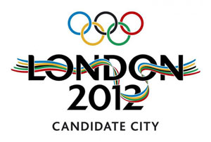
There have been two London 2012 logos: one for the bidding process created by Kino Design and a second as the brand for the Games themselves.
The former is a ribbon with blue, yellow, black, green, and red stripes winding through the text "LONDON 2012," making the shape of the River Thames in East London.
 |
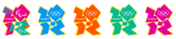
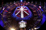
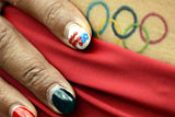
The latter, designed by Wolff Olins, was unveiled on June 4, 2007 and cost £400,000. This new logo is a representation of the number 2012, with the Olympic Rings embedded within the zero.
This will be the first time that the same essential logo is to be used for both the Olympic and Paralympic games.
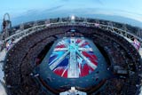
The standard colors are green, magenta, orange and blue; however the logo has incorporated a variety of colors, including the Union Flag to promote the handover ceremony.
The flexibility of the logo has also enabled sponsors to incorporate their corporate colors into a personalised version, such as Lloyds TSB, British Airways,and Adidas.
 |
London 2012 has stated that the new logo is aimed at reaching young people. LOCOG chairman Sebastian Coe stated that it builds upon everything that the organizing committee has said "about reaching out and engaging young people, which is where our challenge is over the next five years." One observer, a managing director of an advertising agency, noted that the logo bore a strong resemblance to the logo for the 1974–1982 children's television program Tiswas, commenting that appealing to young people is difficult, and that they will see right through attempts to patronize them.
Early public reaction to the logo, as measured by a poll on the BBC website, was largely negative: more than 80% of votes gave the logo the lowest possible rating. Several newspapers have run their own logo competitions, displaying alternative submissions from their readers.
In February 2011, Iran complained that the logo appeared to spell out the word "Zion" and threatened to boycott the Olympics. Iran submitted its complaint to the International Olympic Committee, describing the logo as "racist", asking that it be withdrawn and the designers be "confronted". The IOC "quietly" rejected the demands, and Iran announced it would not boycott the Games.
A segment of animated footage released at the same time as the logo was reported to trigger seizures in a small number of people with photosensitive epilepsy. The charity Epilepsy Action received telephone calls from people who had had seizures after watching the sequence on TV. In response, a short segment was removed from the London 2012 website. Ken Livingstone, then London Mayor, said that the company who designed the film should not be paid for what he called a "catastrophic mistake."
A blogger at the BBC said that "London 2012's new logo has got the country talking [although] not in the manner the organizers would have hoped." One employee at a design firm described it as "well thought out" and anticipated it would "become a source of pride for London and the Games."
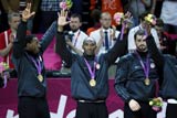
Medal Count |
||||
| 1 | 46 | 29 | 29 | |
| 2 | 38 | 27 | 22 | |
| 3 | 29 | 17 | 19 | |
| 4 | 24 | 25 | 33 | |
| 5 | 13 | 8 | 7 | |
| 6 | 11 | 19 | 14 | |


Most Viewed
Gold medal moments
Age not a problem for Olympic dreams
Olympic moments to remember
Beijing Olympics just keeps on giving
Against the Olympic spirit
Olympic fashion tips
Taking success overseas
Competition Schedule