|
 |
|
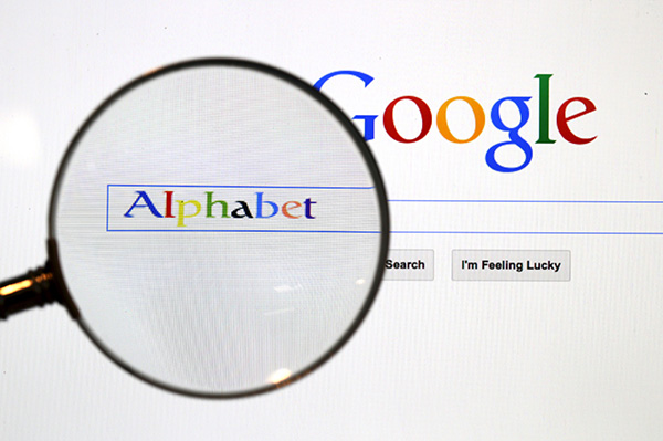
A Google search page is seen through a magnifying glass in this photo illustration taken in Berlin. Google Inc put a new logo on top of its search box featuring a custom-made sans serif font in bold typeface in early September. [Photo/Agencies] |
You don't have to be a typography expert to realize sans serif fonts are becoming a clear choice for tech company logos.
Apple Inc's new sans serif font San Francisco, launched in its latest iOS 9 system on September 17, replaced Helvetica, another sans serif font. Google Inc put a new logo on top of its search box featuring a custom-made sans serif font in bold typeface in early September. Chinese computer maker Lenovo Group Ltd also changed its logo from a sharp italic font to a straight-up sans serif font similar to Google's.
Wait, what's sans serif?
In typography, a sans serif, gothic, or simply sans, is a group of typefaces that does not have the small line or edge attached to the end of a stroke in a letter or symbol. The term comes from the French word sans, meaning "without", and "serif", a deduction of Dutch for "line". Typefaces with the tiny projecting features are called serif.
This column is printed in Miller Daily II, a digital type of Scotch Roman that had been cut around 1810 in Glasgow. It is widely used in the journalism industry for its classic looks and unique shape of each letter so readers are less likely to misread words. It is a typical serif font, while the China Daily masthead at the top of the front page is in sans, in case you wonder.
So, why sans for tech firms?
Visually, sans appears modern, unconventional, distinctive, energetic and fresh-qualities a tech company would like to be associated with.
Think of the current Google logo. The sans letters in vivid colors give users a refreshing feeling of intimacy. The minimal decorative strokes embody simplicity, the current rage in visual design.
Tech firms, who call themselves a disruptive force, see the younger generation as their target customers, a group whose sense of fashion and self-esteem is stronger than their parents'.
Providers of tech products and services felt a need to quickly build an emotional bond with their target customers using the language they speak.
Font, a key element in visual design, is often a company's first point of "contact" with its patrons. First impressions count. Fonts matter.
Well, there is no data to suggest a sans serif font would lift sales of tech companies.
Copyright 1995 - . All rights reserved. The content (including but not limited to text, photo, multimedia information, etc) published in this site belongs to China Daily Information Co (CDIC). Without written authorization from CDIC, such content shall not be republished or used in any form. Note: Browsers with 1024*768 or higher resolution are suggested for this site.
License for publishing multimedia online 0108263 Registration Number: 130349 ![]()