Netizens accuse Didi of copying new logo
|
Web users say the logo for smartphone app Didi Chuxing (lest) looks like the logo for Dentech, a dental care institute. Provided to China Daily |
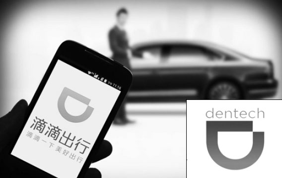
Didi Chuxing, a leading taxi-hailing app in China, has created controversy among Web users who say its new logo looks like a copy of a dental care institute's brand created by an Indian designer.
Didi Kuaidi, the biggest Chinese rival to Uber Technologies Inc, rebranded as Didi Chuxing and launched its new logo on Sept 9, attracting huge attention in the industry and on the Internet.
The logo is a horizontal capital letter D that looks like a smiling mouth. It has a gap in the top right corner and is orange, the same color as the app's original logo.
Behance, an online platform established in 2006 to showcase and discover creative work worldwide, is where netizens have drawn their brand copying assertions from. Compared with Didi's new logo, the Behance version is a bit longer and slimmer, and has a blue-purple gradient color.
According to the platform, the brand was designed and uploaded in November 2013 by Neeti Gokhalay, who comes from Bang alore, India. She created the logo for Dentech, a 25-year-old dental care center in Mumbai. As of Tuesday, the design had been viewed about 6,700 times.
Commenting on assertions from the Internet, Ye Yun, director of Didi's public relations department, told Chongqing Economic Times that the new logo was simple and originated from the deformation of a letter, so it was normal to find other similar logos.
He said the new logo was not a copy, just involved similar inspiration used by both Chinese and Indian designers.
Didi said on its official micro blog that the company spent three months searching for brand logos at home and abroad before its new logo was published. The company said it did not know of any similar logos until Sept 7, two days before the new logo's launch, when it was told of the Indian designer's work by a Web user, who is also a designer.
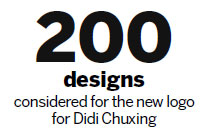
Didi said it had considered using a backup logo, but decided to stick to its original idea after discussions and a small-scale investigation, because the horizontal capital D, which was selected from more than 200 designs, best meets the meanings the company wanted to express.
"The new logo represents that we will serve the public with innovative thoughts in the mobile Internet to let everyone have a satisfactory experience," said a Didi's micro blog, Xinhua News Agency reported.
"The gap in the logo means that Didi will continue its commitment to pursuing perfection and innovation," it said.
Although the company has applied for trademark registration of the new logo in China, which many industry insiders said is very likely to gain approval, Didi is trying to communicate with the Indian designer and hopes to reach a deal through negotiation.
Chen Haiyun, a lawyer in Chongqing, told Chongqing Economic Times that according to trademark law in China, the trademark rights have a territoriality principle, so Didi would have no trouble with trademark infringements if it did not extend its business to India and the dental care center did not set up outlets in China.
haonan@chinadaily.com.cn
(China Daily 09/23/2015 page16)