Institutions select deep blue as their choice for color of the year

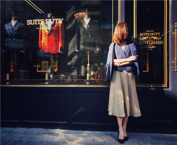
The rise of blue reflects consumer desire for relaxation, reliability and adventure, says a PPG report, and blue is set to stay, being a popular choice for automobiles over the next four years.
Pantone describes classic blue as a "restful" color, which "brings a sense of peace and tranquility to the human spirit, offering refuge", on its official website. PPG adds that the choice of blue reflects people's demand for trust and calm. It sees Chinese Porcelain as "a blend of cobalt and moody ink blue that imparts calmness, hopefulness and restful sleep-precious commodities in a restless world".
"The need for simplicity and escapism from technology is, in part, the reason that consumers are craving blues that bring us closer to natural elements such as the sea and sky-elements that represent peace and serenity," Schlotter says.
Blue is making its presence felt in other sectors too.
British perfume brand Jo Malone London released a new cologne and chose blue for the packaging and gift boxes at the turn of the year and cosmetic brand Charlotte Tilbury had blue fireworks on the casing of the newly launched eye shadow compact.
PPG suggests Chinese Porcelain can mix well with different colors: Blended with light hues, it shows vibrancy and a confidence to express oneself; with pineapple and carrot cake, it shows earthy sustainability, and with organic blue-greens, it can bring the sense of a summer breeze.
Many Chinese professionals in the fashion fields also prefer blue.
Zheng Rongkai, 35, has been managing the brand image for a children's wear company for three years. Every season, he is in charge of photo shoots for the lookbooks of the Starroom brand and for its show space designs, from the lighting to displayed installations. Blue is his favorite, not least because of what it can suggest when paired with other colors.
"Blue turns pink into something less frivolous, more vague; it makes black less boring; it makes gray more flexible, and it basically makes every element more mysterious," Zheng says.


